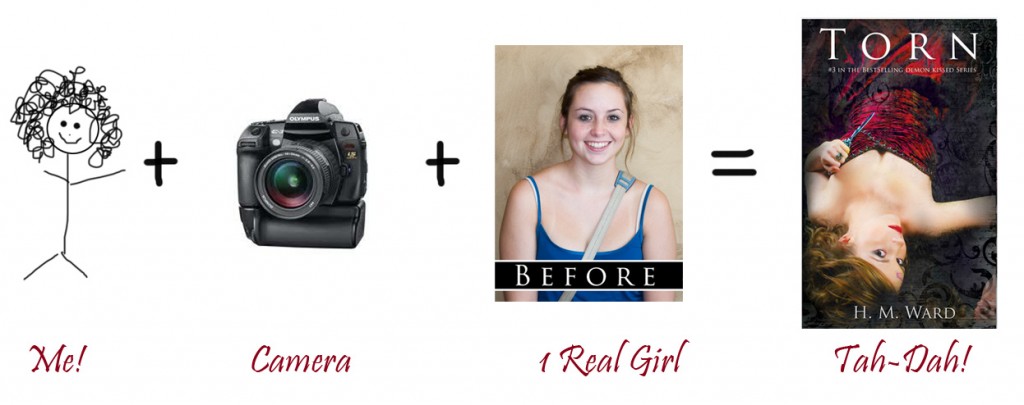
It’s been drawn to my attention that I have an unusual perspective when it comes to being a writer. Not only do I write and market all my books, but I also create the covers–from scratch. And not stock photography, pre-fabby, template kinda scratch. I’m talking non-Betty Crocker insta-cover, going-the-full-mile kinda scratch. The kind of covers that truly start with nothing but a camera and an idea.
Here’s what I got to work with. (Yes, I am speaking in my muppet urban vernacular in this post, because it’s fun and trendy, so you’ll have to deal).
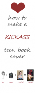
You see this? I got a regular girl, a camera, and my brain. That’s it. That’s all I start with. (Want to see everything bigger? Click the image and it’ll open full size).
We usually shoot a few different outfits, something plain–but who likes plain? I mean, why not pull out all the stops and throw on a ball gown? These are Young Adult book covers after all. (And once you own a ballgown, I’m convinced you’ll wear it everywhere. Because they are that much fun! It’s only a matter of time until ballgowns become street clothes). Anyway, a big dress with lots of folds in the fabric adds texture, depth, and interest–in other words it photographs really fricken awesome!
Next, I find stuff that will help the flow of the final image and tie into the story. In this shoot, the model is wearing Collin’s ring and holding Shannon’s dagger. The images were shot (usually) with one large soft box and fill light. I wanted high contrast between the skin and the background and dress, so I made sure this series had more evenly lit skin in the shots for the TORN cover below. On the Demon Kissed cover (jacket pictured below), things are much more shadowy. The short lighting gives that tense ominous feeling that I <3.
After the model is set up, we start shooting. The shoot runs 2-3 hours depending on what we are doing. Going into a new shoot, I usually have an idea of the kind of feelings I want from the final image and then try to figure out the poses that match. So its like reverse-engineering a little bit. The entire series will have all the covers shot on the same day at the studio.
Most images tend to be low-key (dark images with a lot of black) since that reflects the mood of the Demon Kissed series. When I shoot romance covers next week for more Ella Steele’s upcoming releases, they’ll be brighter to match the moods of those books. (YES! I’m writing more romance under the name Ella Steele. I’ll talk more about that in another post).
I can’t tell you how important it is to make sure the mood of the book matches the mood of the cover. If you have happy hearts, bright colors, and unicorns–then read Demon Kissed–you’ll have a wtf moment and your brain will explode. Okay, maybe not explode, but if you were looking for something fun and light, and got something dark and sexy, you might not be too happy with me. The cover is one of the things that worried me about going the traditional publication route, since I’d have no control.
So, if you remember one thing from this post it should be this: MOOD MATTERS.
After the shoot, we look through the images. You might be thinking, FUN! Well, in a way it is, but what is actually happening is that I am looking at a series of sister shots (a bunch of shots that look nearly identical). It’s like looking at a filmstrip, and playing spot-the-diff. After going through each and every image, I’ll chose the one that I like best for the cover.
The 4 images above are unedited and uncropped. They’re straight out of camera – which I NEVER show to anyone cuz it’s like walking around the mall in nothing but underpants, and I’m not that kinda girl. But for the sake of art, I decided to post them today, so you can see the process that goes into making the book cover. Parts of making the cover are fun. Parts are tedious. I mean, do you see the difference b/t #1 and #3? Imagine looking at 30 shots of those, where the differences are so minor most people can’t see them. This is where being a freaky OCD perfectionist helps. I can use my super-critical skills for good instead of evil, and all while not donning a cape. (Although capes are really fun, right?)
So I chose an image. We hold a huge ceremony and bust open champagne and… well, no. Not yet. But keep your cape on. We’re almost done and you’ll want to fly and show all your friends.
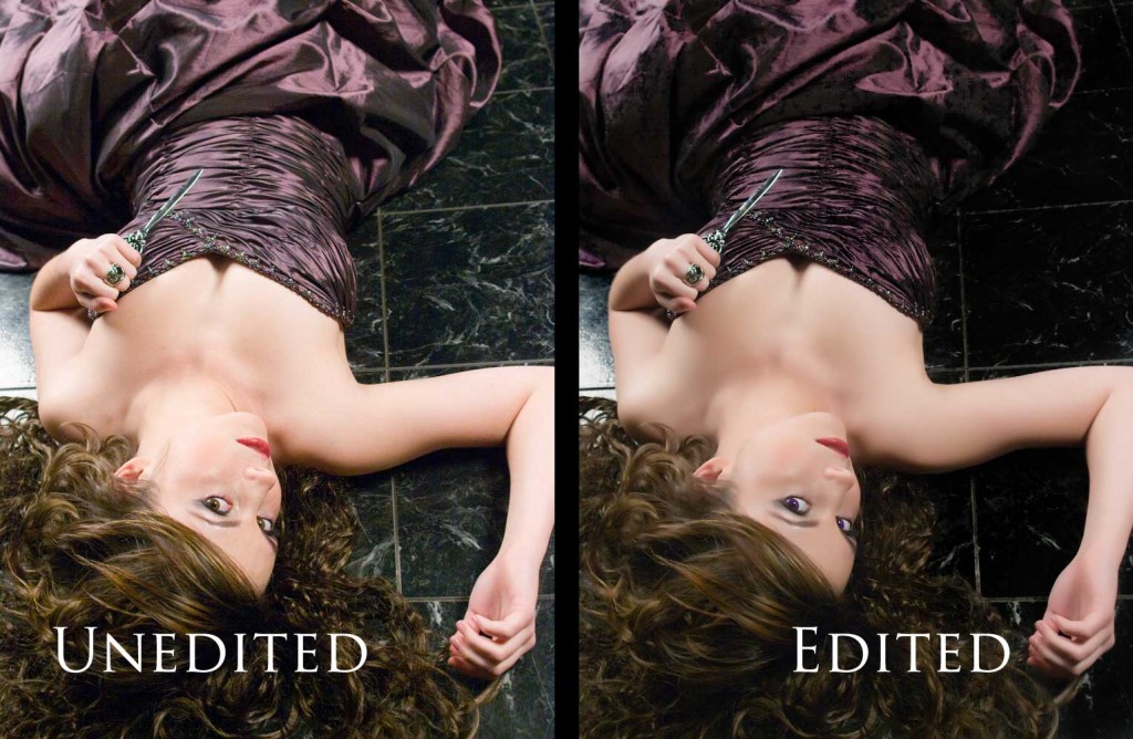
 The next thing is editing the image. My models wear stage make-up when we’re shooting. It makes editing go a lot faster. The thick make-up hides skin issues and makes certain that the model still has color on her face after the cover is fully processed. During the final stages of making the cover, the image’s brightness is pushed, and it’s possible to lose skin tones, so the edited image above is actually intentionally underexposed.
The next step is pulling her off the background and starting the cover design. If you purchase stock to make your covers, this is where your cover begins. If you’re a control freak like me, look at all the things you didn’t get to control! Sometimes it pays to use stock, but if you are writing a series, promoting the hell out of it, and then have the same cover models as everyone else–well, it’s not very good branding. Dude, I’ve seen at least 17 covers, all by different authors, who have the same exact couple on the cover. The images were being used by the Big 6 and Indie authors.
It makes your branding moot when other people have access to the same images.
Business brains might be thinking, Yes, but is a photo shoot cost-effective? The answer: Hell yes! Stock images are expensive and now Indie authors can’t buy the little images because the pixel dimensions are too small for Amazon’s new requirements (they are asking 2500px on the longest side for ideal viewing). You want ideal viewing. That’s the whole purpose of the cover – to lure in readers. Having it showing like crap won’t help you. So, your covers suddenly shot up in price if you are using stock. Price a photoshoot. You can find anything from $30, which can include the disc, and up. Photographers’ rates are all over the place. In other words, it’s worth looking into.
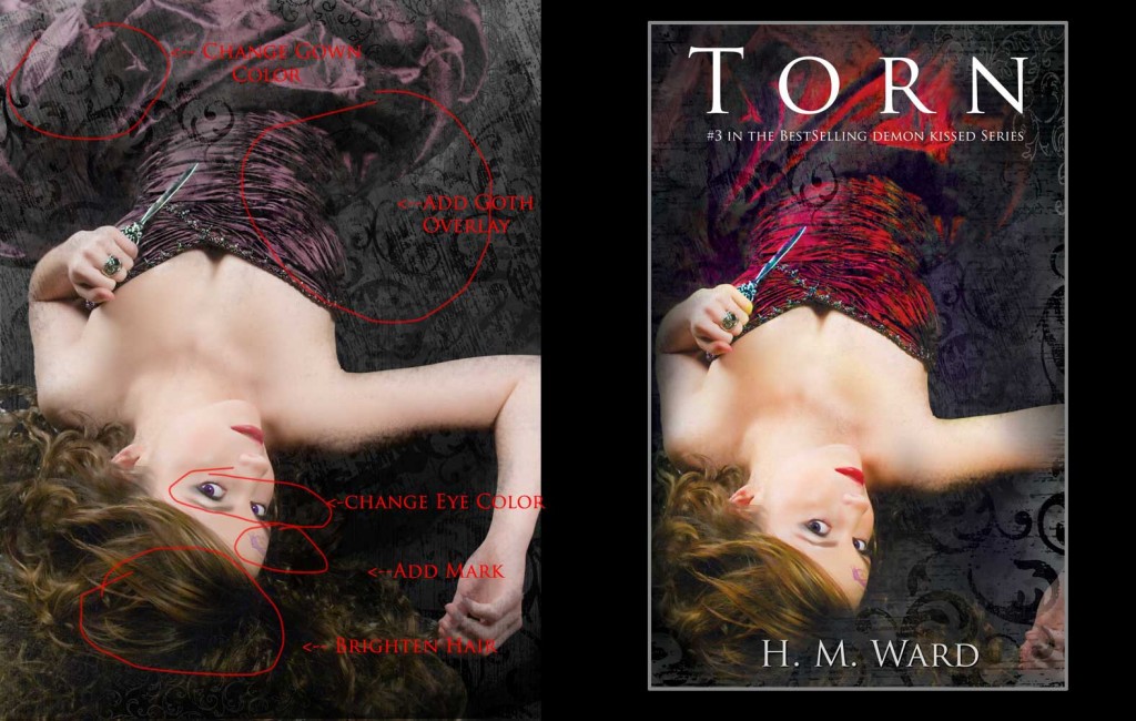
So I chose the shot I want to use, but it’s not perfect. It’s not EXACTLY what I want. It has the feeling, and she looks pretty, but it needs something. I can see Shan’s blade and Collin’s ring, but I want the dress to pop more. Although I LOVE purple, the Demon Kissed cover is purple, I want this cover to be different.
So, for TORN, I decided to make her gown red to match her lips.
As soon as I change her gown to red, I can see everything. I know I want the gothic-ish overlay. The entire series uses those to help tie them together. I need to add her Martis mark to her forehead, the violet mark Ivy has in the book. I change her eye color and make them rimming violet, like in the book. And I brightened her hair. It was getting lost a little bit after applying the layers of the overlay.
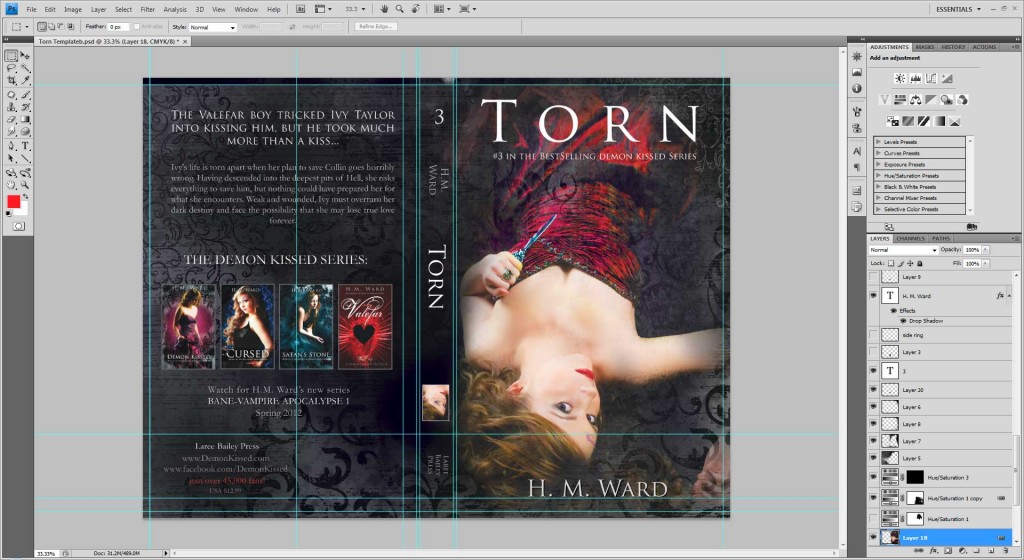
So, now my image has about 35 layers. Here is a screen shot of what things look like at this point. (And I’m working in CMYK for print. I’ll convert it later to RGB for computer screens. I’ve found it’s easier to maintain rich colors that way).
Next, I take my cover image (minus the words) flatten it and drop it onto the print template. I check my gutters and crop lines (the little blue/ green rulers) to make sure everything lines up  correctly so that it will print right. My books are printed at a standard trade paperback size, in this case 5″x8″. If I just made the template at 5×8, when the book is printed, it won’t look right. You have to leave extra room so the cover can be cut before it’s bound to the rest of the book. You also need to leave a place for the barcode. Your printer can give you the margins so you can place guidelines on your cover to make sure everything lines up correctly. If you can do the interior margins, this is the same kind of thing.
Next, the text is added. All my covers have large text on the back. It’s the hook from the first book in the Demon Kissed series, then they go into their own description. Then I add my other book covers from this series to the back of the book. Again, images lend to mood. The more images you have, the better. There’s a jewel pic on the spine, a little glimpse of the cover pic. And the number in the series, author, publisher, etc. I also put on the back cover a new series that is coming out next.
And this is what it looks like when the jacket is complete and ready to print.
It’s kind of cool to see the process from start to finish. It has that awesome-esk feeling of seeing a before and after shot. Below is another completed book jacket. It’s for the first book in the Demon Kissed series. Remember how I told you that I LOVE purple? Yeah, well, I have to make a consious effort not to make every single cover purple. That also means my favorite cover in the entire series is this one… cuz it’s PURPLE!
That’s the evolution of a book cover. It starts as a hunched-over, slobbering hairy guy, and ends with a pretty girl in a dress holding a dagger. Tah-dah!
GET DEMON KISSED NOW:
H.M. Ward is the bestselling author of the Demon Kissed series, and an award winning photographer. To see all of her covers, click here.

